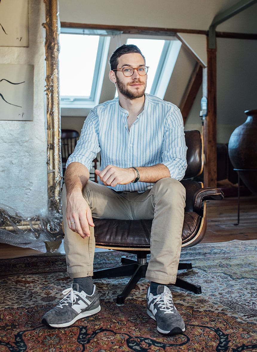
Studio Texier aspires idea-driven solutions, modern concepts, simplicity and visibility. The goal is to communicate the brands story within a comprehensive, clear visual language to ensure longevity and help clients to become understandable and meaningful.
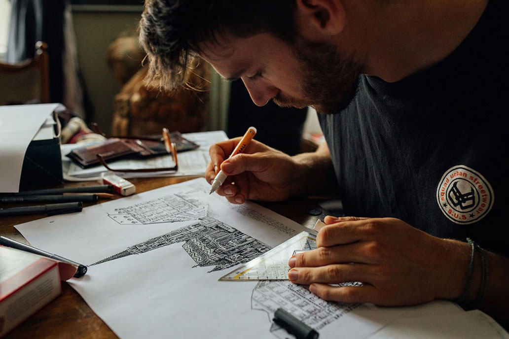
Tristan Texier is a graphic designer and art director, specialised in the fields of branding, editorial design, packaging and communications. Over the past 10 years he has helped clients across disciplines to develop refined visual solutions in various mediums from paper to digital.
Originally from Austria, Tristan Texier is currently living between Vienna and Auckland.
Services
Identity
Concept Development
Art Direction
Editorial Design
Packaging Design
Print Production
Website Design
Illustration
To get in touch, please email to:
info@studiotexier.com
Follow me on:
— Behance
— Pinterest
— Linkedin

Beran Bienen Co.
—
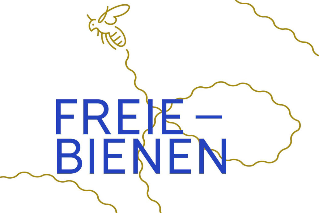
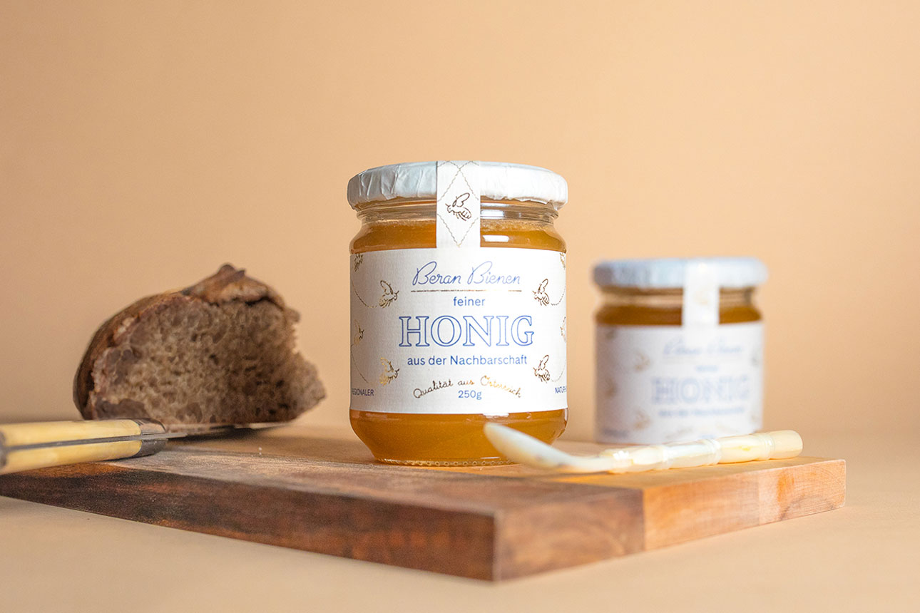
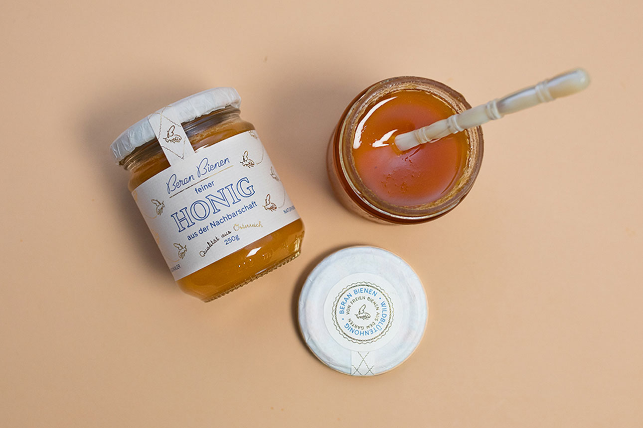
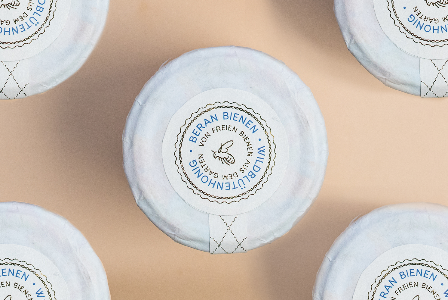
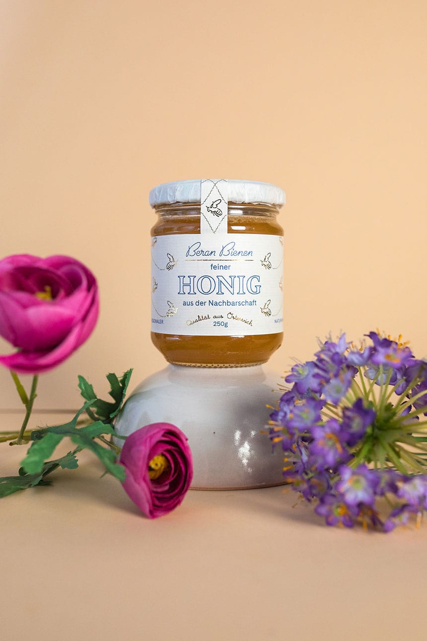
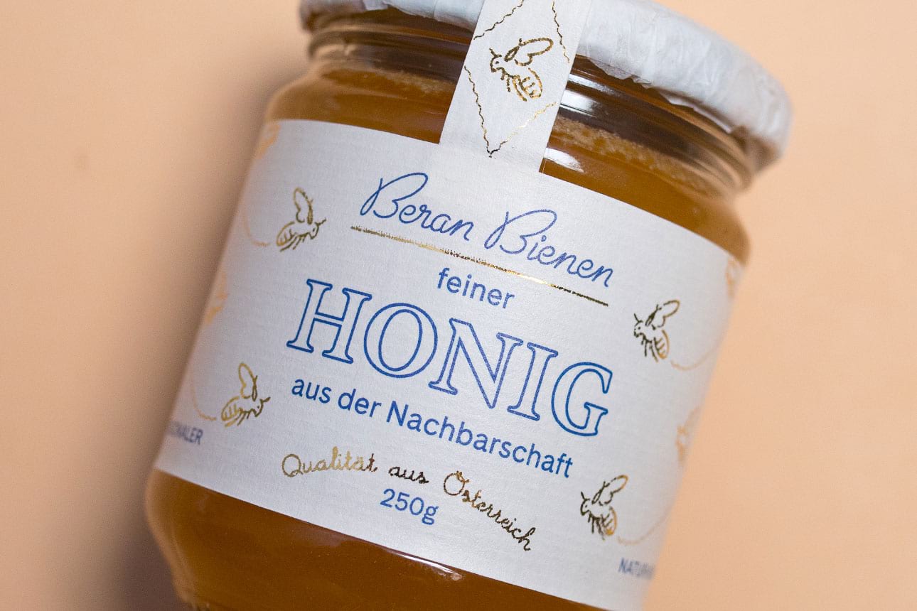
Beran Bienen (Beran bees) is a small batch honey production by the Beran family. In their garden, between lush forest and surrounding vineyards, they let their bees roam freely, which provides them with an exceptional product.
Extending across naming, packaging and branding – clean, modern typography, an iconic logo and handlettered mark highlights the pride in their honey in a prestegious, yet humble manner. The identity is built around their happy bees – a family member that carries the families initials in its wings. This attention to detail truly reflects Beran Bienens family-driven brand positioning.
Ginpanse Gin
—
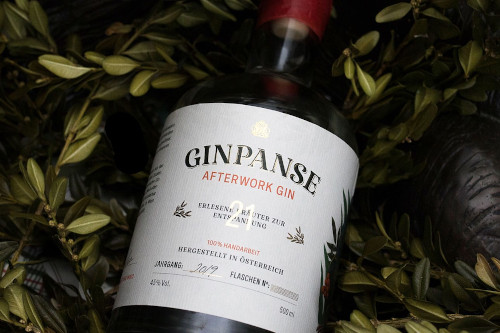
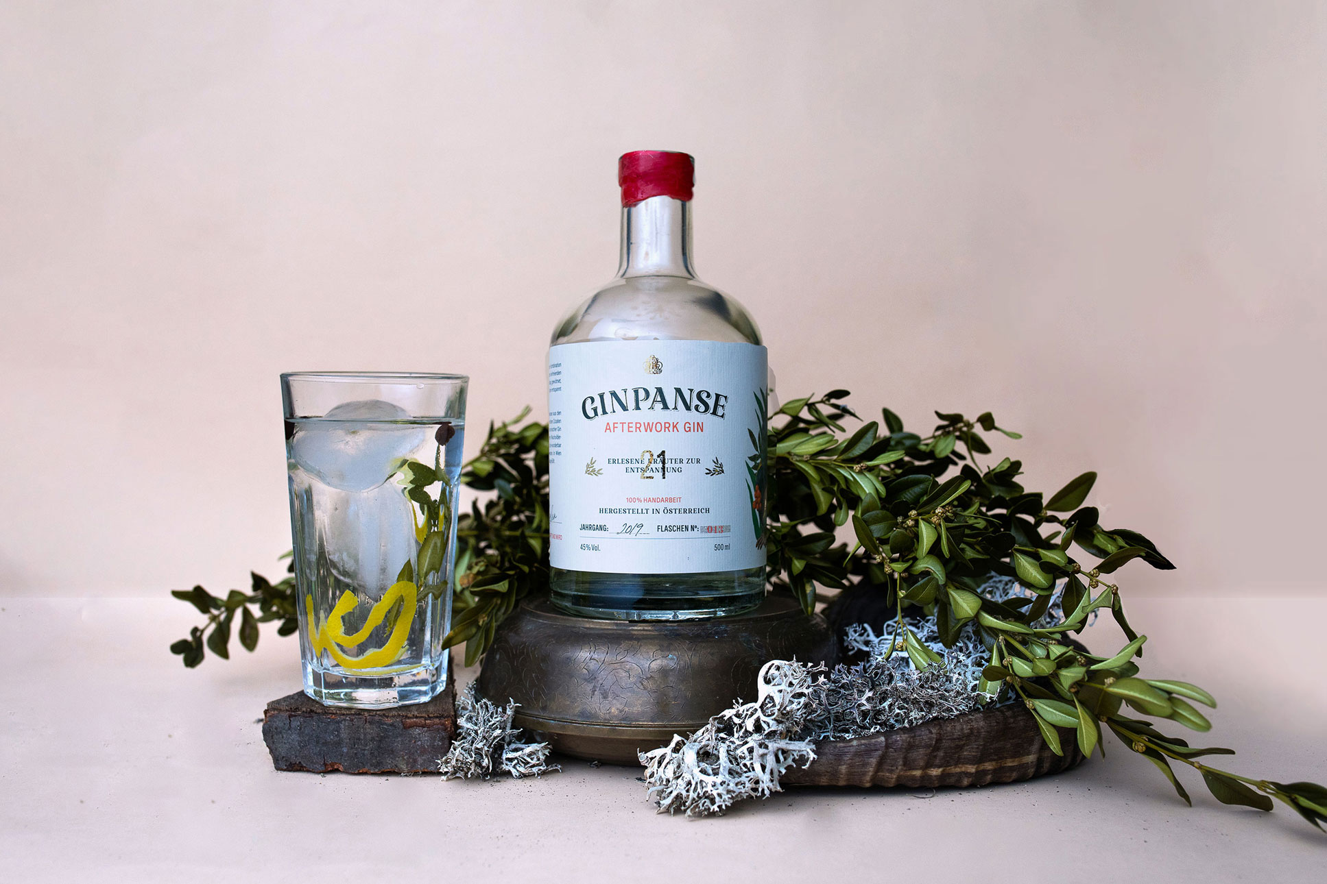
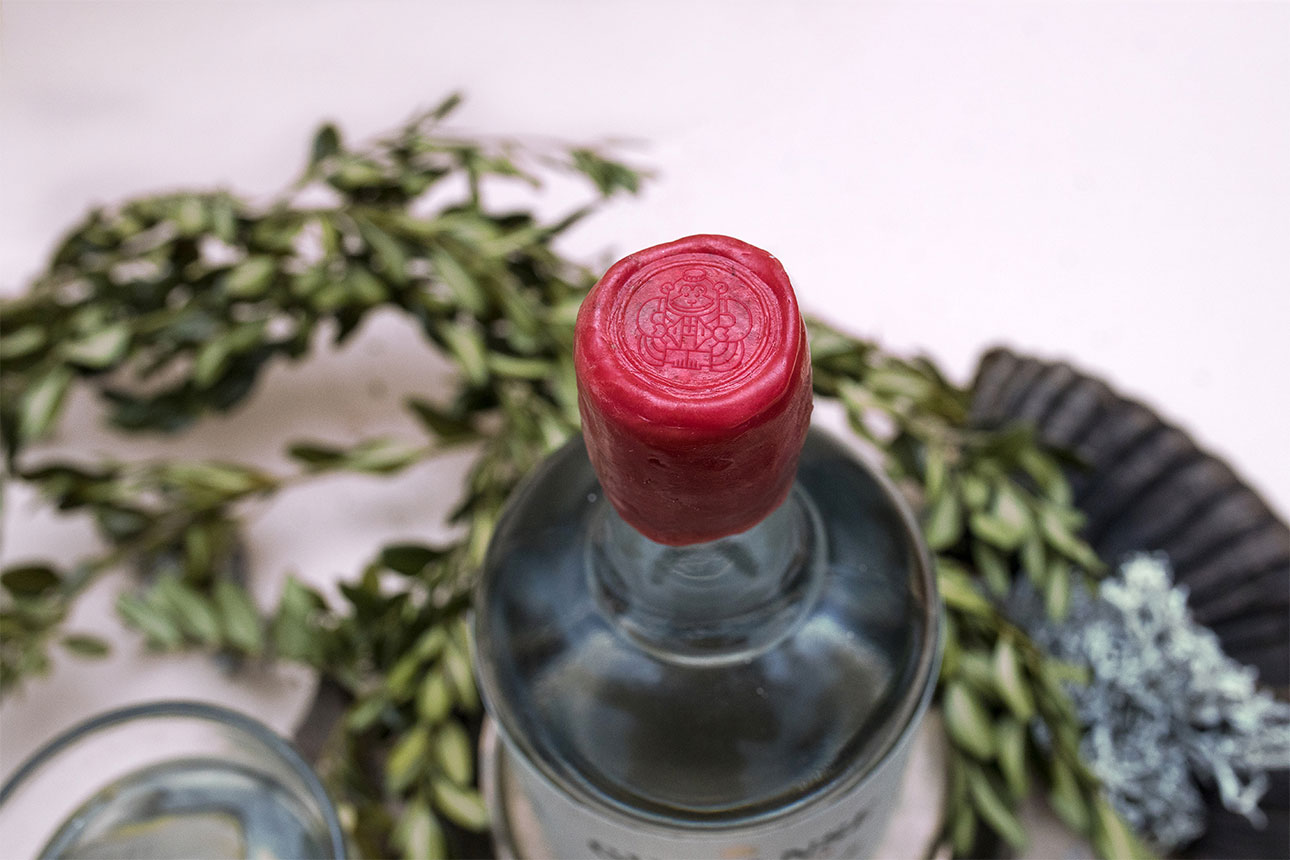
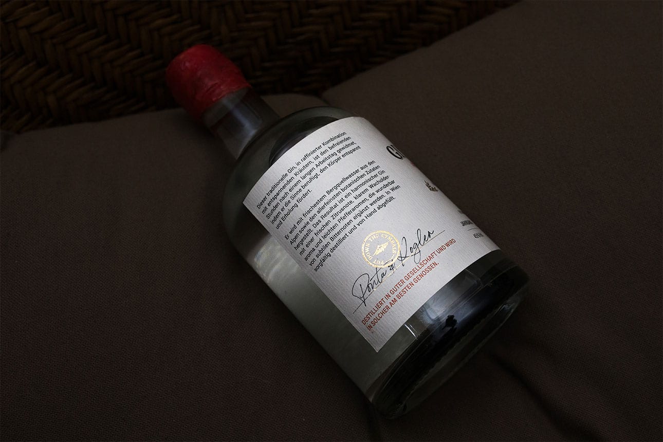
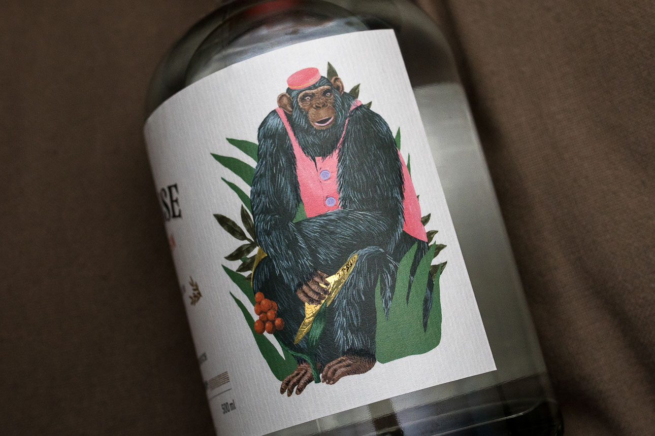
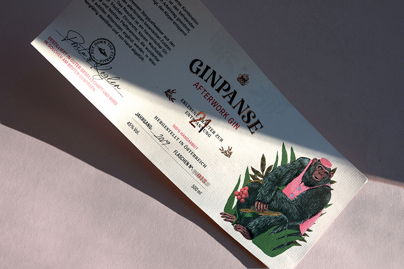
This Afterwork Gin, is a collaboration with a dear client friend. He wanted to launch a limited edition Gin, so I was asked to design a label that portrayed the ”after work“ concept. 100% handmade in Vienna, this new western Gin features the speciality of 5 recreational herbs to optimize relaxation after a hard day of work.
The label and logo feature an illustration of the Daishin Toy Chimp, that finally puts down its cymbals and finds the time to relax. This idea is continued with graphic details through out the label.
Popcorner Co.
—
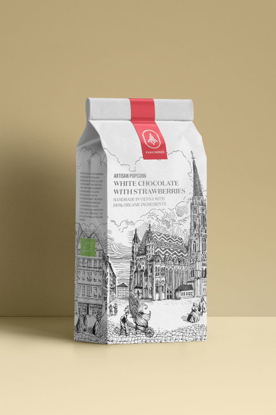
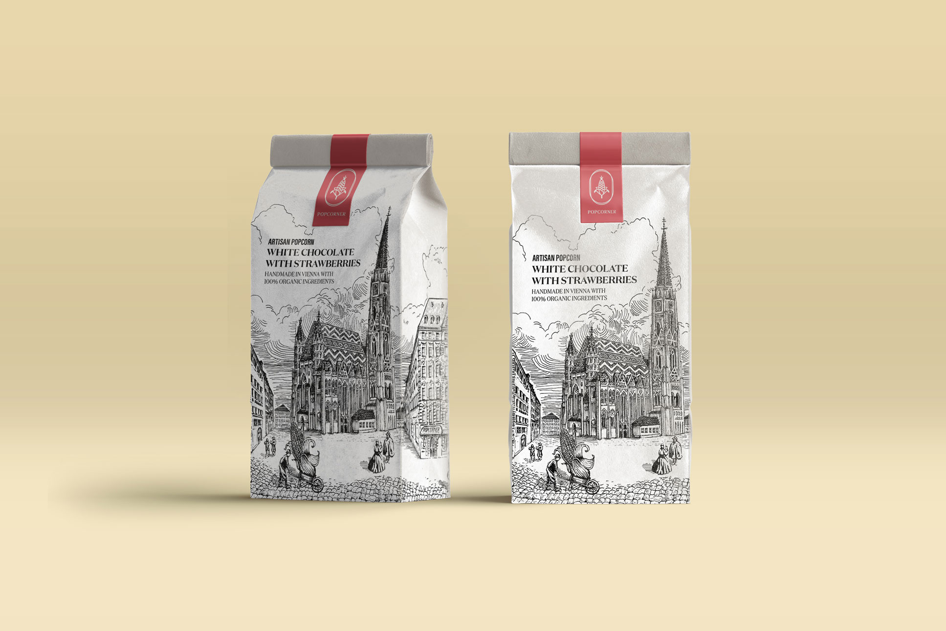
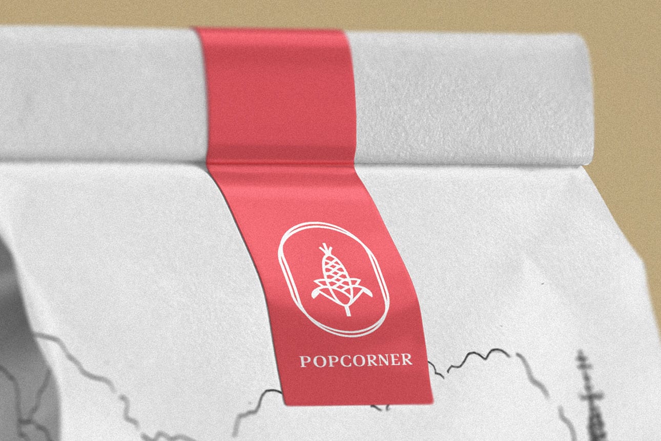
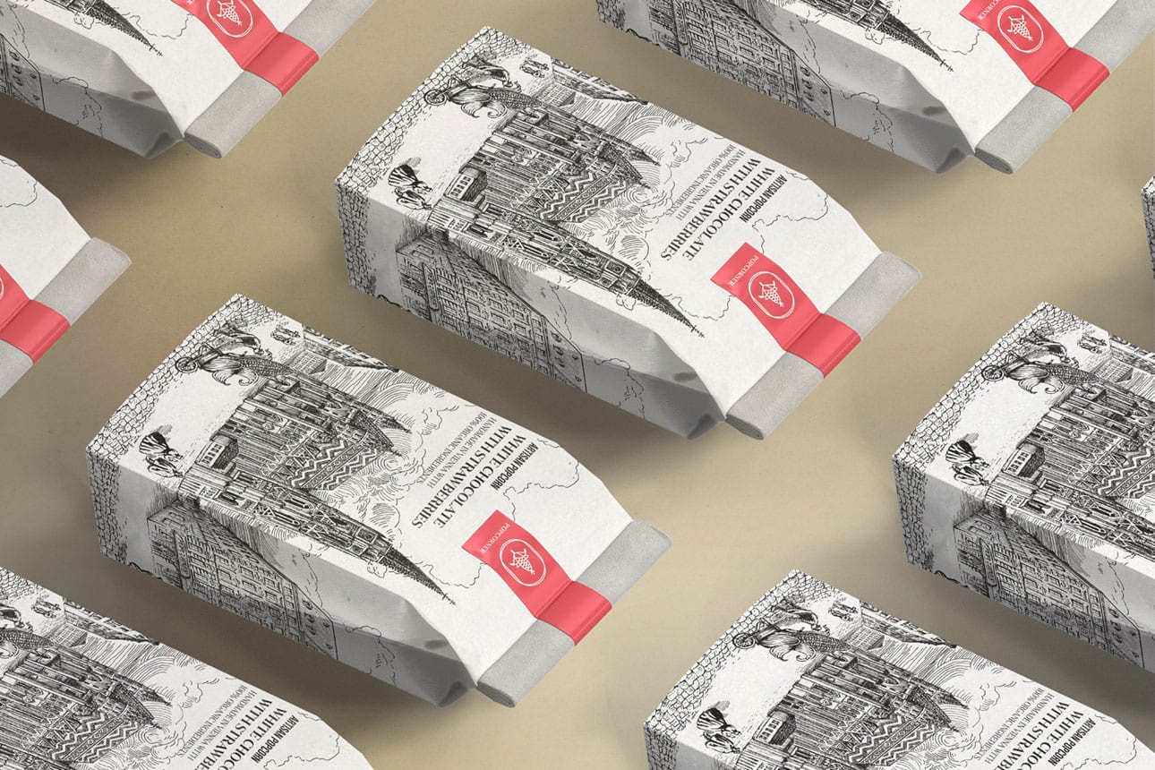
Popcorner – an Austrian brand founded on the dream to make an organic, low calorie snack and their handmade sweet popcorn creations became soon a regular treat for many residents of central Vienna.
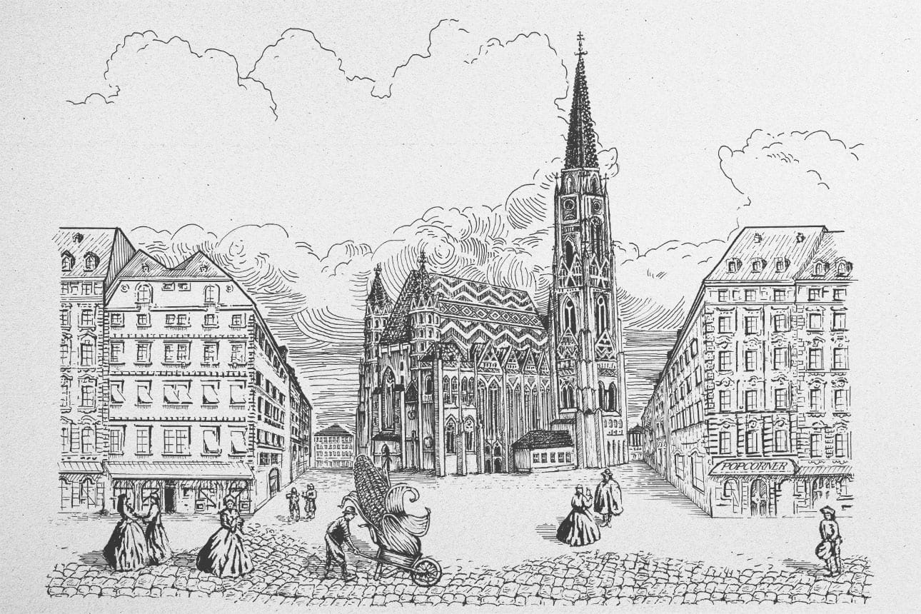
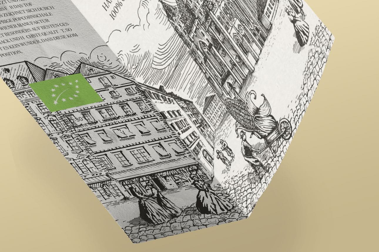
With a packaging and logo redesign that would help establish them in Japan, I translated the brands characteristics to convey the essence of Popcorner. An artisan good, hand made in the historical heart of Vienna, which is also the source of inspiration for their distinct traditional flavours To convey the heritage, the centrepiece shows the iconic “St. Stephens Cathedral“.
4PRO Consulting
—
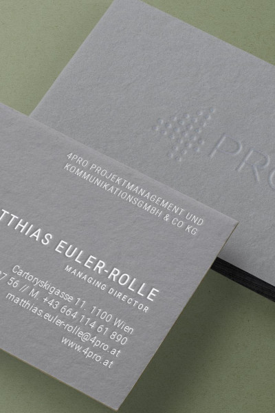
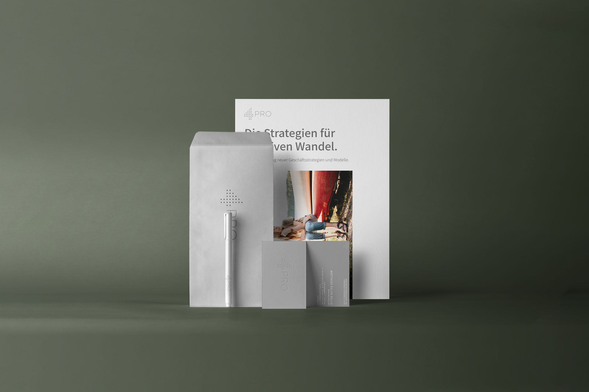
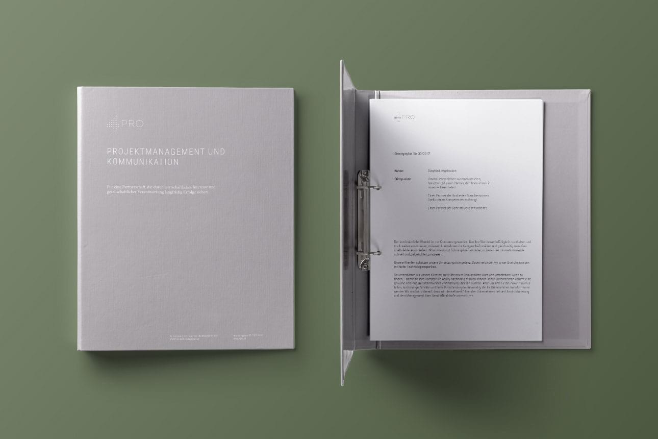
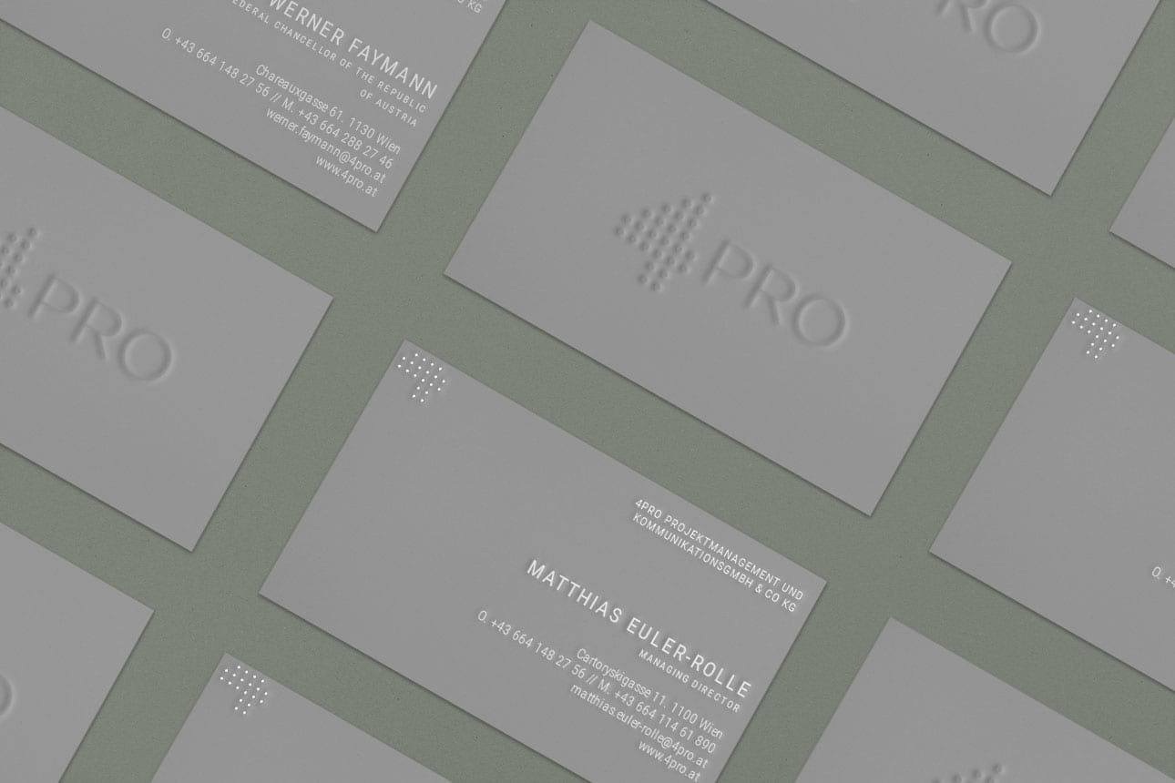
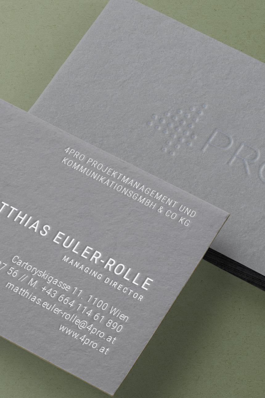
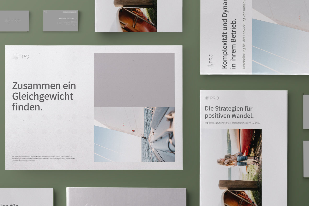
4PRO is a well-considered agency, guiding and consulting national and international clients and are best known for their vast expertise in the fields of politics and communication.
They were in need of a visual identity, which included applications such as stationery, digital templates and signage. I interpreted their aesthetic into an identity which was minimal, yet distinct. Simplicity and restraint was based on careful use of very few elements, that would portrait their integrity and high-level of sophistication and could be deploid on all units.

DNP GmbH
—
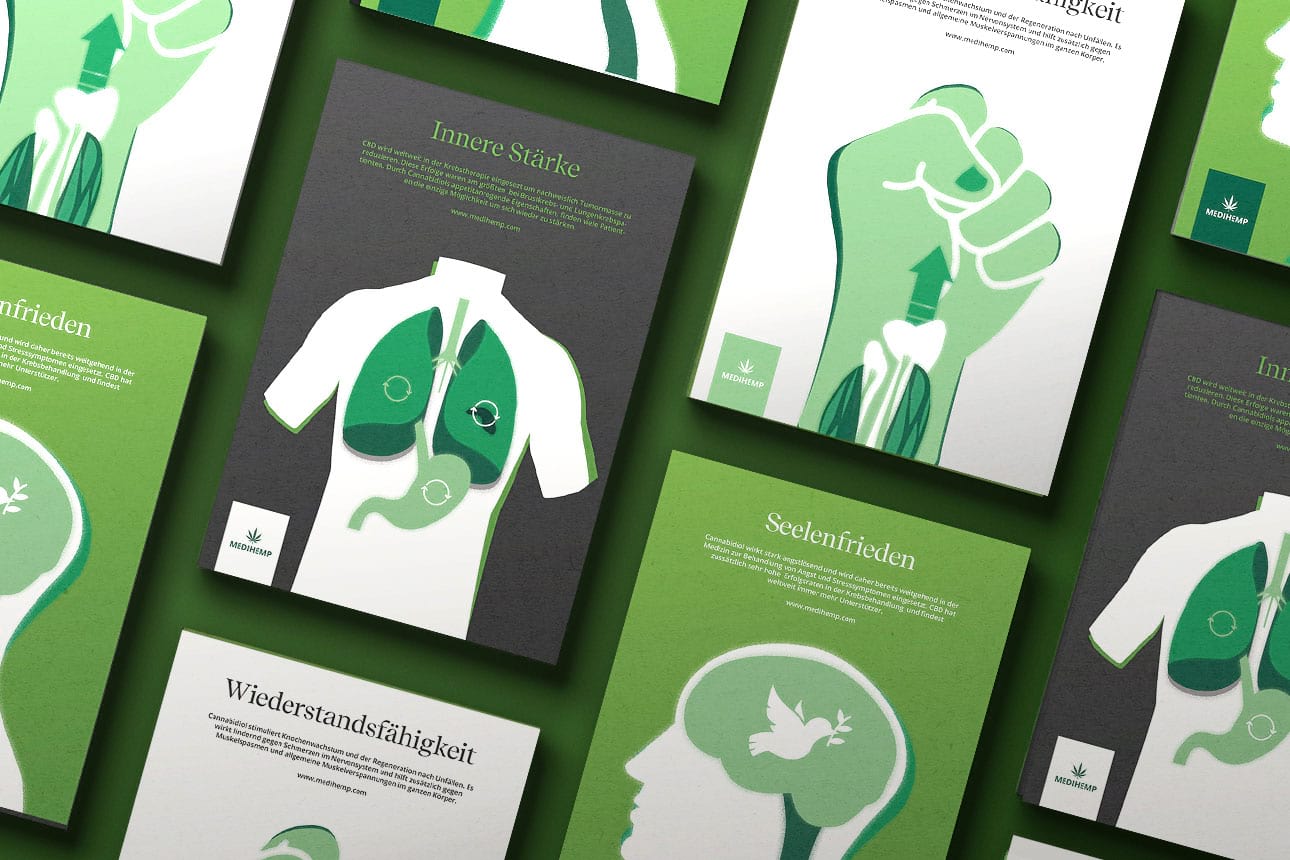
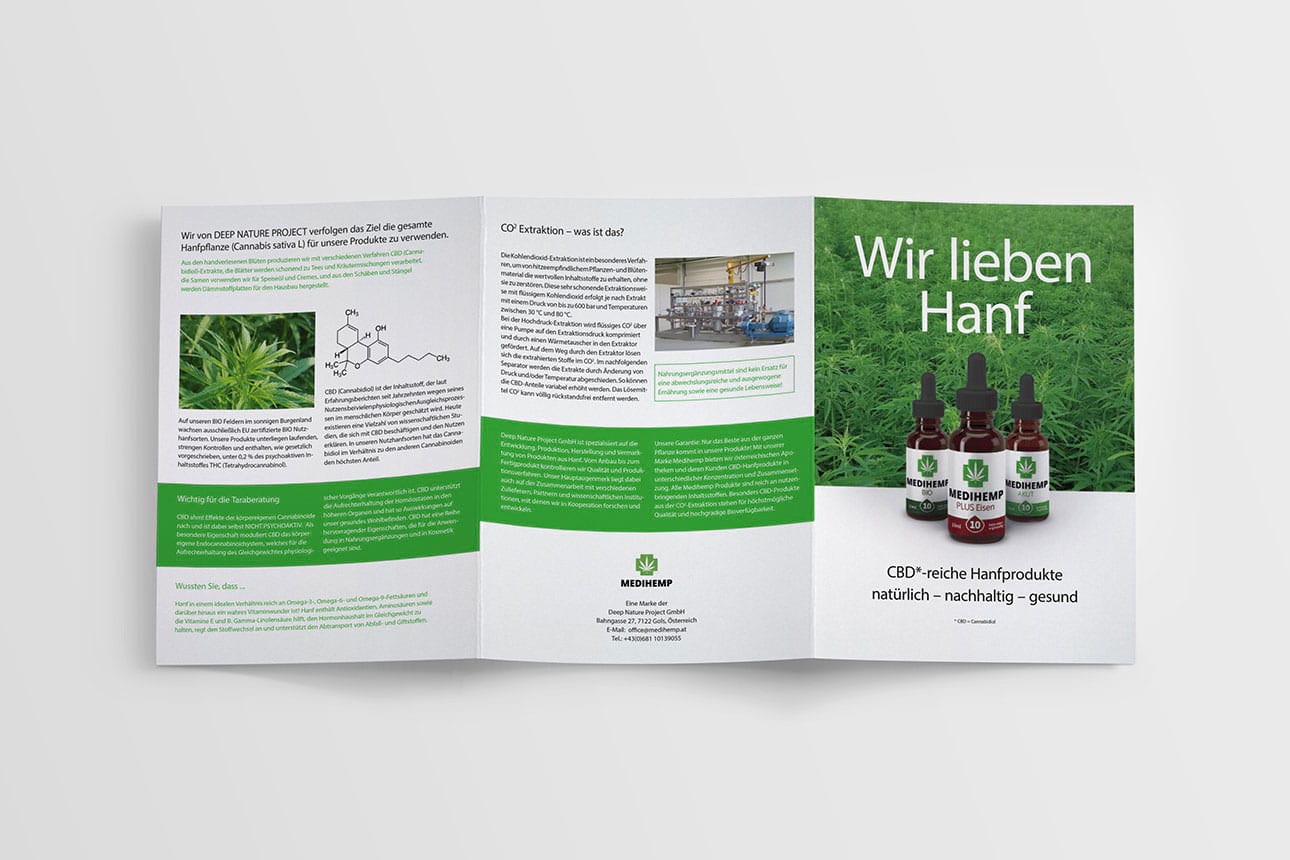
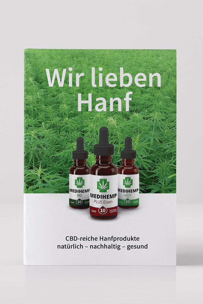
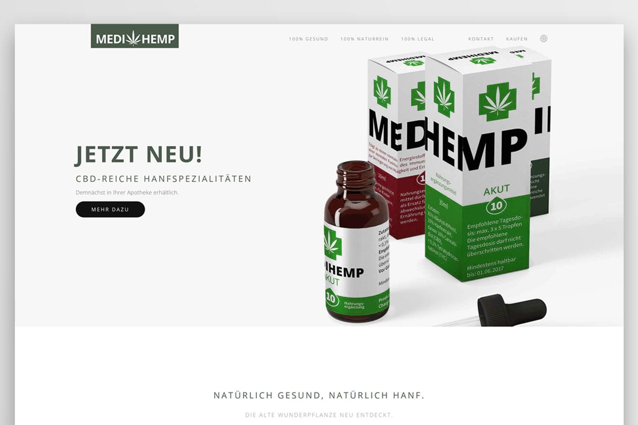
Medihemp – one of Austria’s biggest producer of organic CBD oils and supplements needed support for the launch of their new pharmacy line consisting of packaging, print matter, webdesign and marketing illustrations.
The objective was to create a classical, yet dynamic concept to support the idea that CBD is a versatile medicine that hasn‘t gotten the attention it deserves. Serious playfulness manifests itself in extensive forms, a high contrast colour palette and bold typography with an immediacy and friendly quality that still communicates professionalism.


F&K Immobilien
—
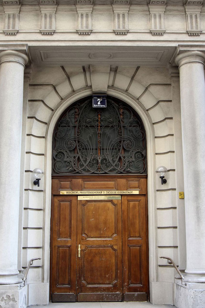
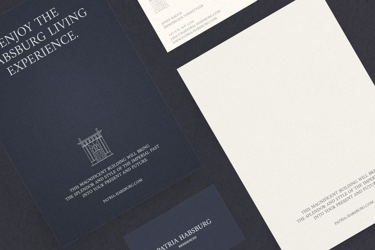
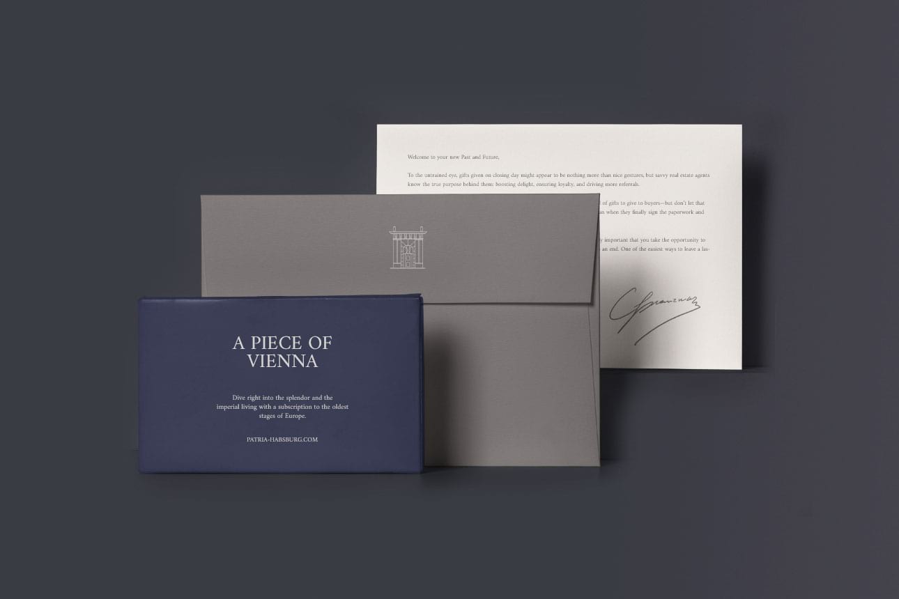
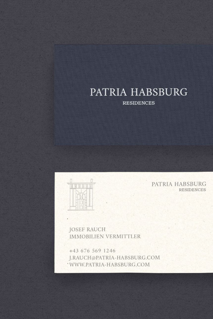
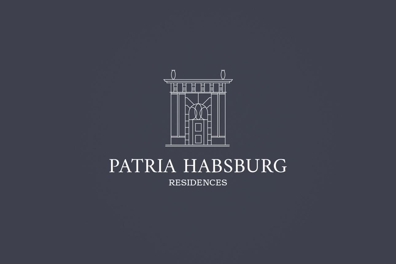
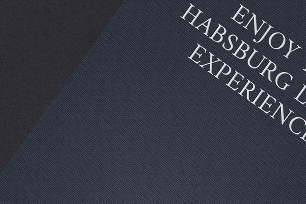
Patria Habsburg is a new property developement in the 1st district of Vienna. This Belle Époque structure, is complimented by a luxurious interior design, of both contrast and cultivated modernism.
I was commissioned to create a visual identity that would assist the real estate team in presenting the project and to distinguish it within a crowded market. With the intention of caputuring the essence of the building, the identity reflects the brand‘s attention to the imperial history in a contemporary way, comprised of roman serif and the monumental entrance of the building.
Das Hochberg
—
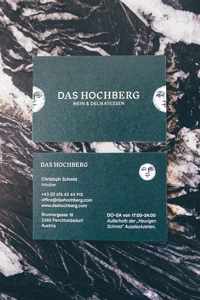
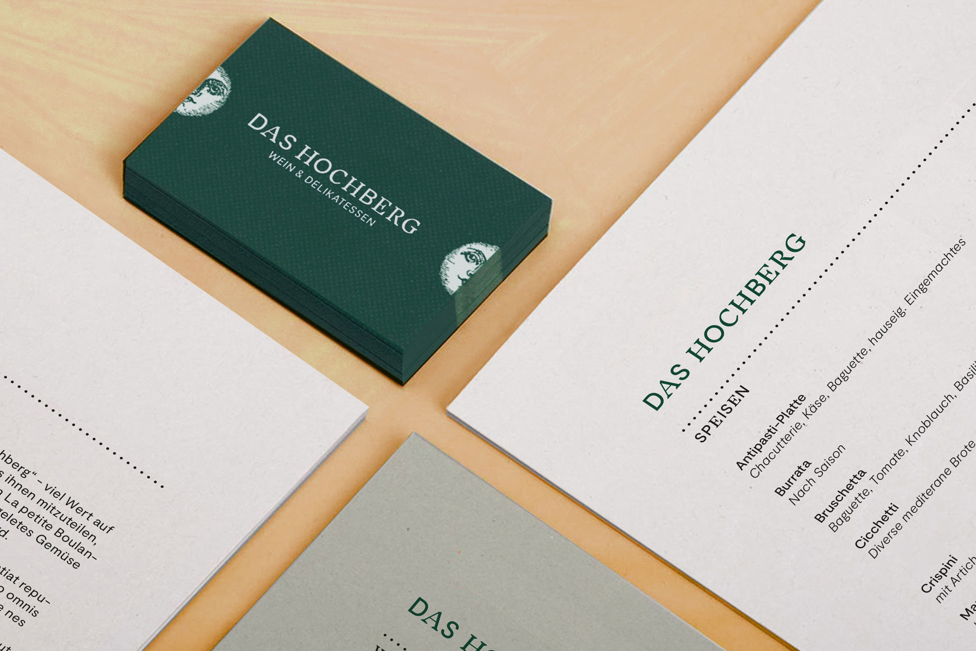
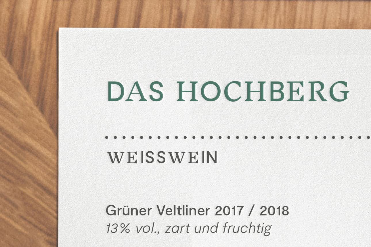
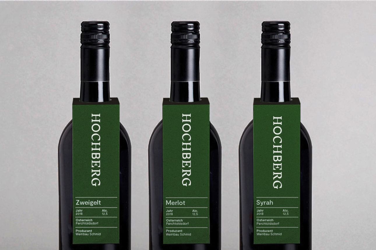
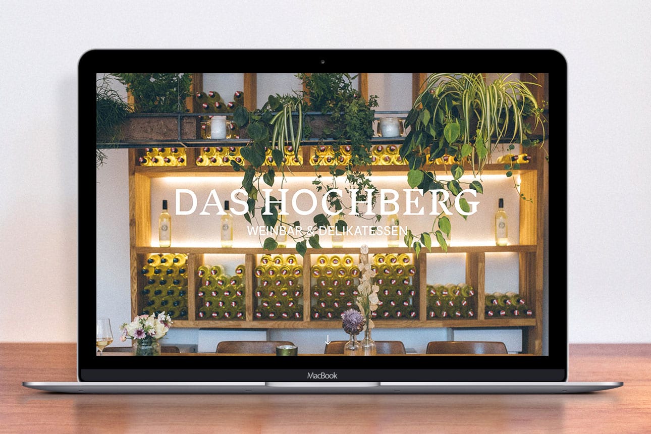
Das Hochberg is a local winebar and foodstore in the south of Vienna. It has a contemporary interior, where it serves wines from the traditional winery of the owners. It’s historical background is punctuated by a classic, high contrast identity, informed by the winebars fusion of tradition and modernity which extends across menus and signage.
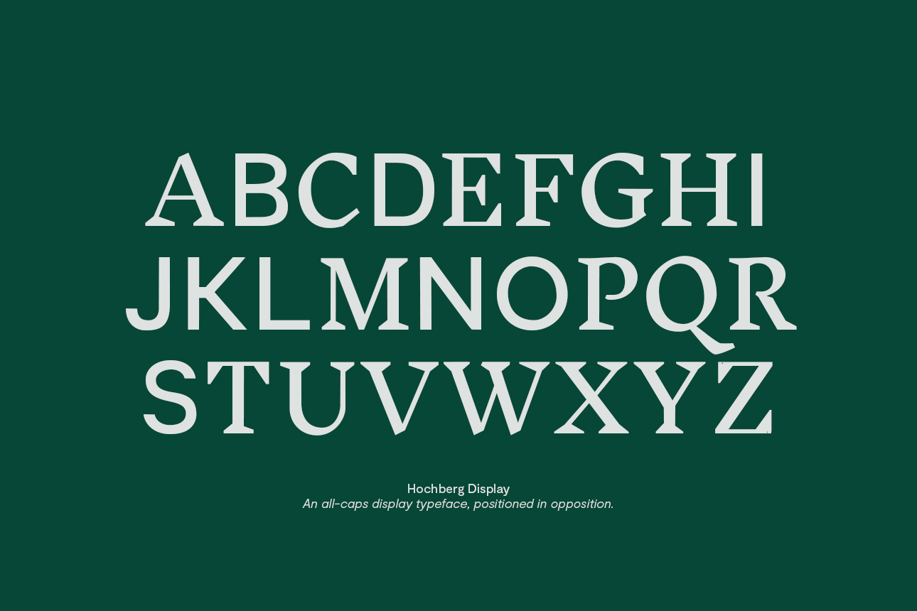
Das Hochberg‘s logotype is a strong and concise distillation of its concept through a custom display typeface that visualizes the meeting of old and new, being successfully used across all media.
—
Photography:
Kasandri
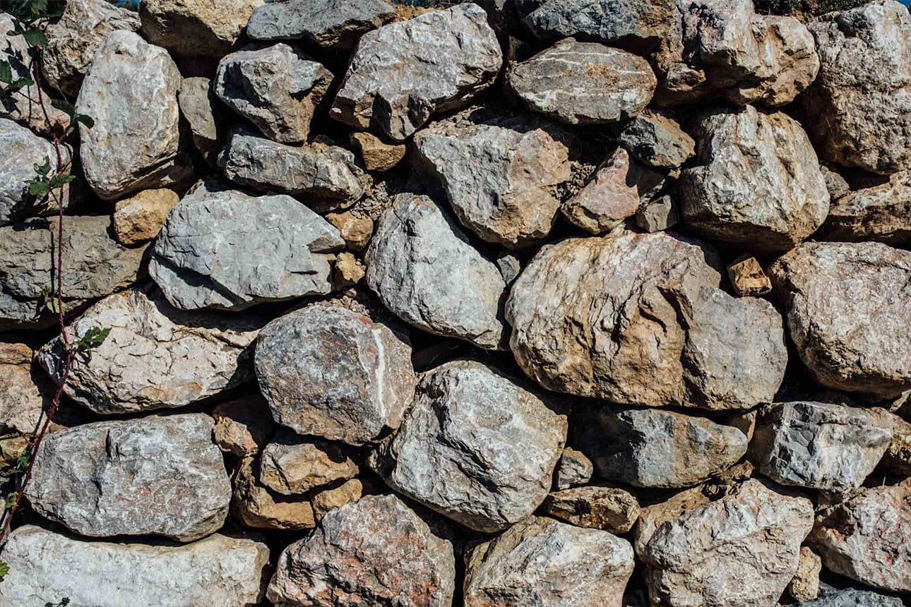
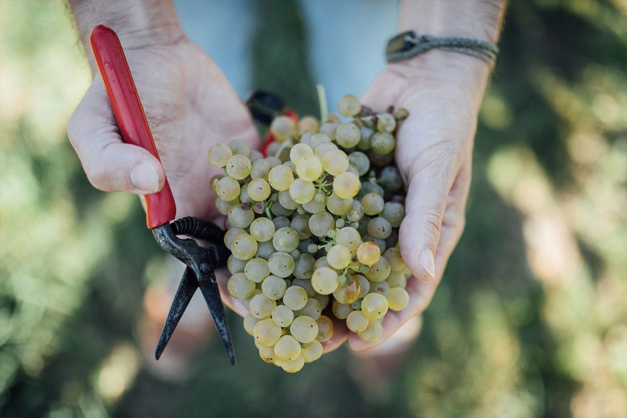
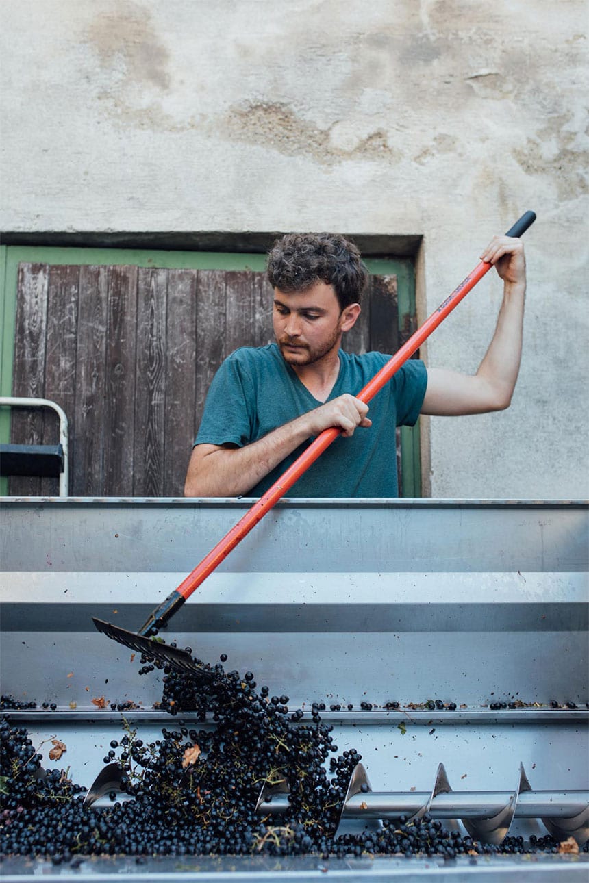
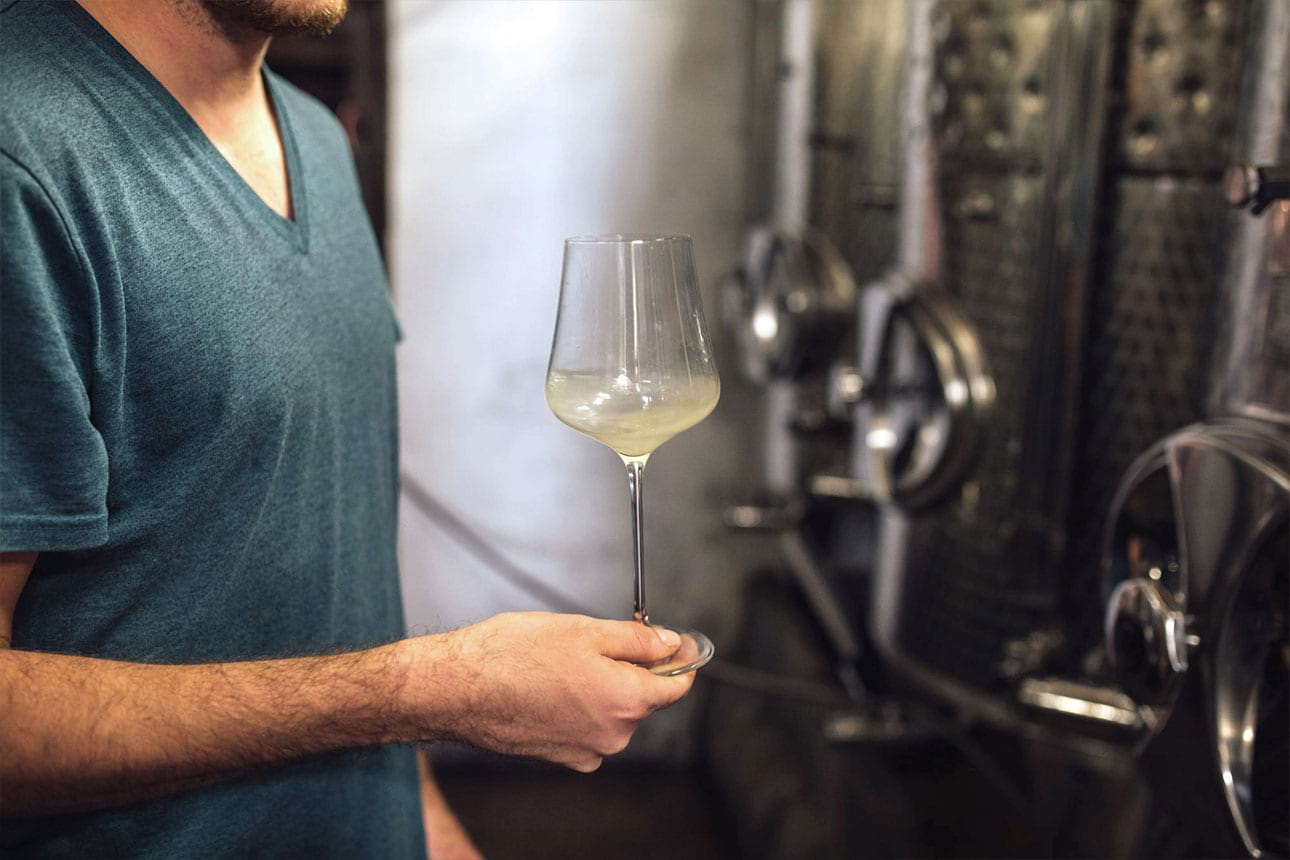
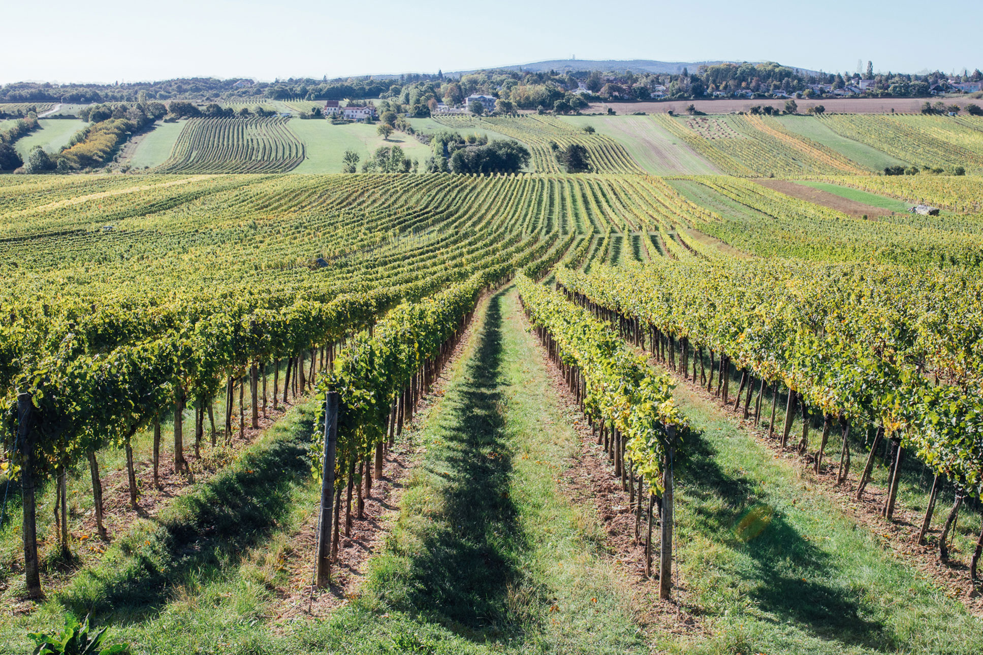
Together with the photographer Kasandri, we developed a new image world for “Das Hochberg” in respect of their core values line tradition, modernity and of course – wine.
We documented their work to create a high-quality, contemporary, yet timeless photo series for web and print, accompanying the young winemaker for a day. We provided a look behind the scenes of a family-owned vineyard from the harvest to the finished wine and communicating the culture, high quality and craftsmanship lived in the winebar and every single grape.
